
This article was published in the Tech Summit 2020 issue
by Michael Moulton, VP of Brand, Divvy
Branding is one of the initial challenges encountered by any startup. It’s natural for businesses to pull together a logo as they’re focused on building out their product, but once you have product-market fit (or some semblance of it), you need to invest in building a brand.
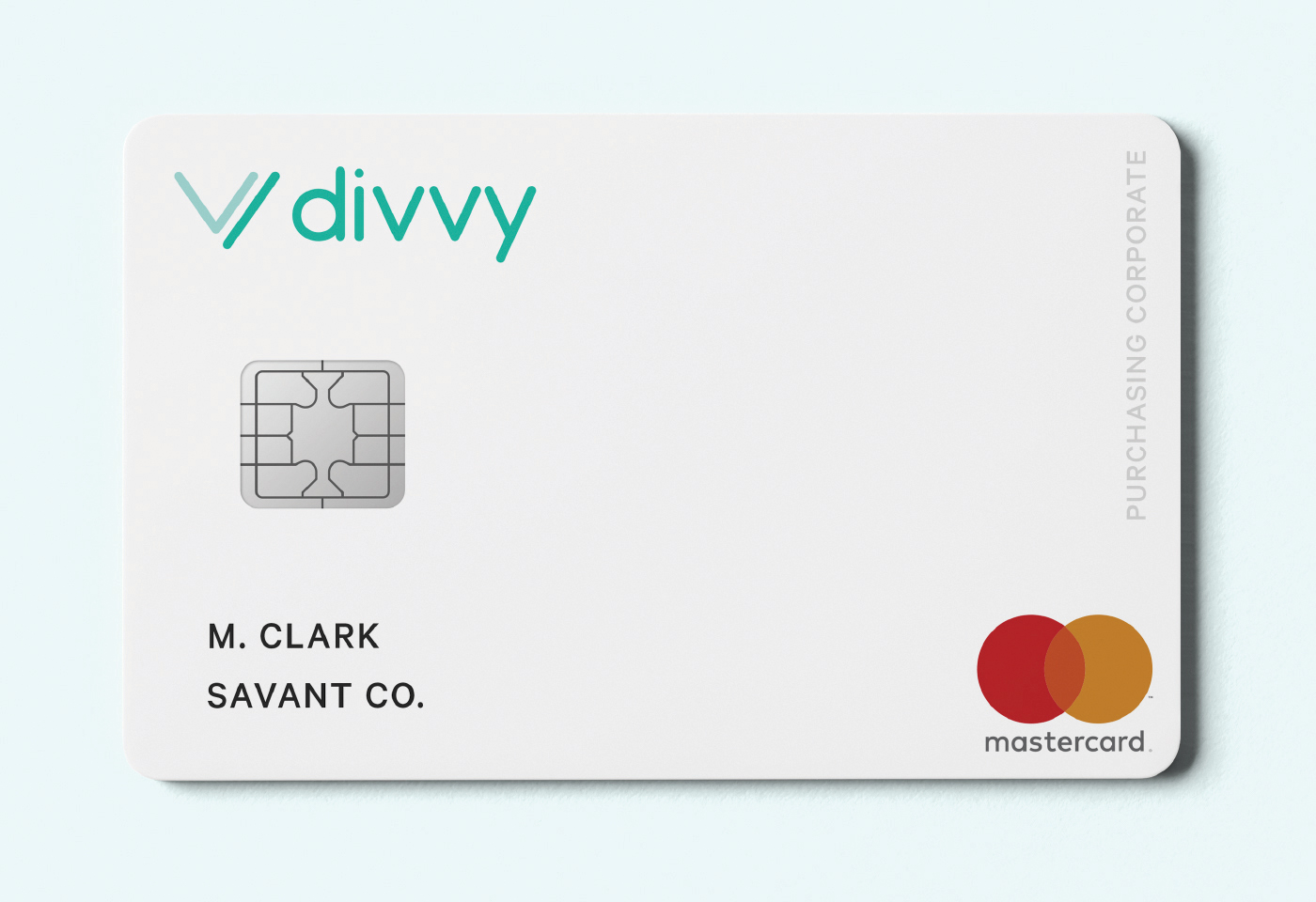
The original Divvy card and logo
Brand is more than a logo and colors. Brand is the fiber that binds a product, company, and market together.
At Divvy, we found product-market fit very early on. After only a year or so of rapid growth, our leaders knew it was time to focus on our brand.
Trust as our anchoring goal
Finances are already a loaded topic for most people. For years many people have been talked down to or purposely misled by financial institutions. Divvy is a modern approach to managing business finances, unhampered by bad decisions from the past. Our brand should strive to make finances feel more approachable, engaging, and, most of all, trustworthy.
The previous Divvy logo was playful and visually appealing, but perhaps a little juvenile in a market where we needed to inspire trust from the outset.
Framework for a framework
As we started to redesign our brand, the team outlined a framework in which we’d maneuver to create all the various aspects of our new brand system.
Our new brand needed to be:
- Trustworthy: Inspires trust in our users from the outset.
- Timeless: Feels both old and new.
- Borderless: Is universal in appeal, regardless of a viewer’s nationality or gender.
- Scaleable: Looks good at large and small sizes.
- Robust: Maintains its identity in a variety of venues and applications.
Admittedly, there were a lot of demands on the brand as we were redesigning — but those demands pushed us to the place we wanted to be.
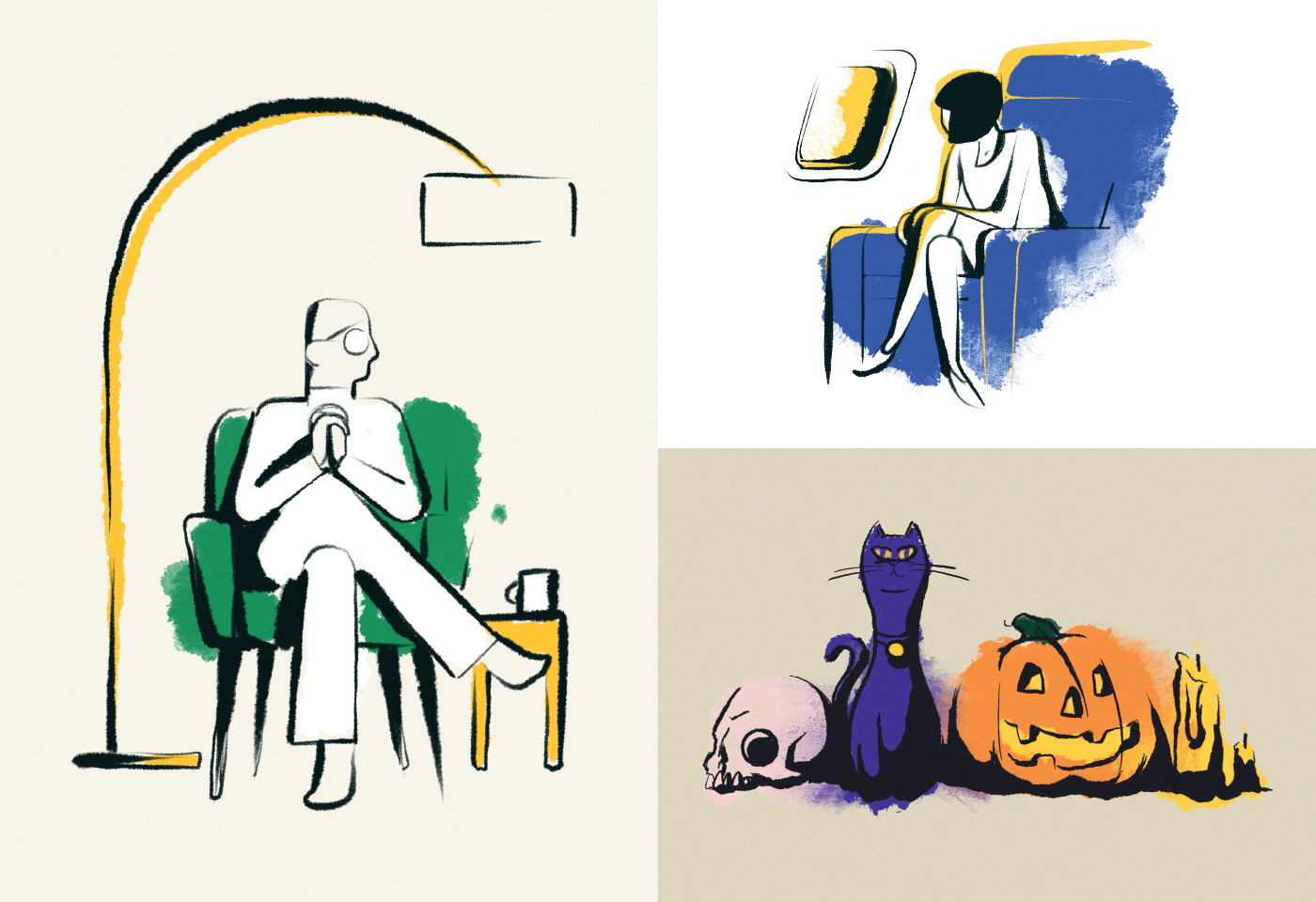
Selection of illustrations from Divvy's "Hubble Design System"
Unity through shared craft
We knew upfront that the Divvy rebrand would be more than just a logo redesign. We were going to rebuild our brand from the mission statement all the way to the app interface. Given that this redesign would be so sweeping, we decided to treat our rebrand like our product; it was led by a coalition of designers and copywriters from our marketing and product organizations.
This collaboration became our greatest strength. Together we worked to redesign “all the things.” From typographic standards rich in financial history to an illustration system informed by comics and Picasso, we built a design culture that fuels our innovation to this day.
Since we’ve kept our branding in-house, everyone has ownership and understands the vision. Designers (on both our brand and product teams) trust and respect each other. We rely on each other for guidance. We’ve cultivated a design culture that transcends design patterns.
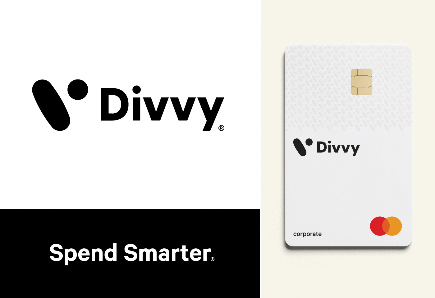
Divvy's logo, card and tag line
It’s evolution, baby
Our brand system is always evolving — and this is an incredible thing. We’re not tied to a dusty brand guide that was created by an agency a year ago. Instead, we’ve created a living, breathing brand system — just like our product.
Great branding can, and should, come from in-house teams. If you have the right combination of talent and vision, you can set the tone for a productive and respectful design culture.
Read the rest of the articles in the Tech Summit 2020 issue of Silicon Slopes Magazine

